Precision Timber Limited
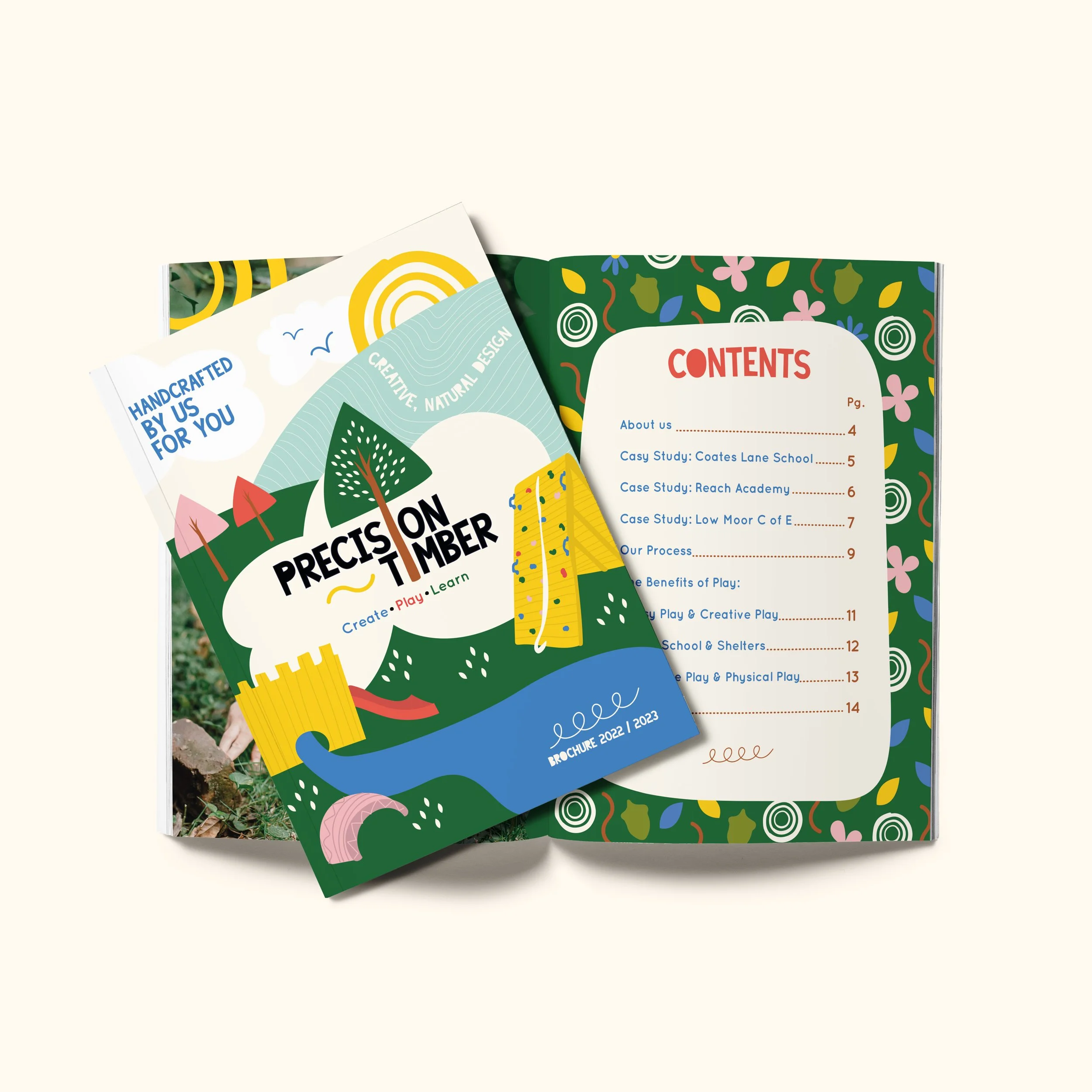
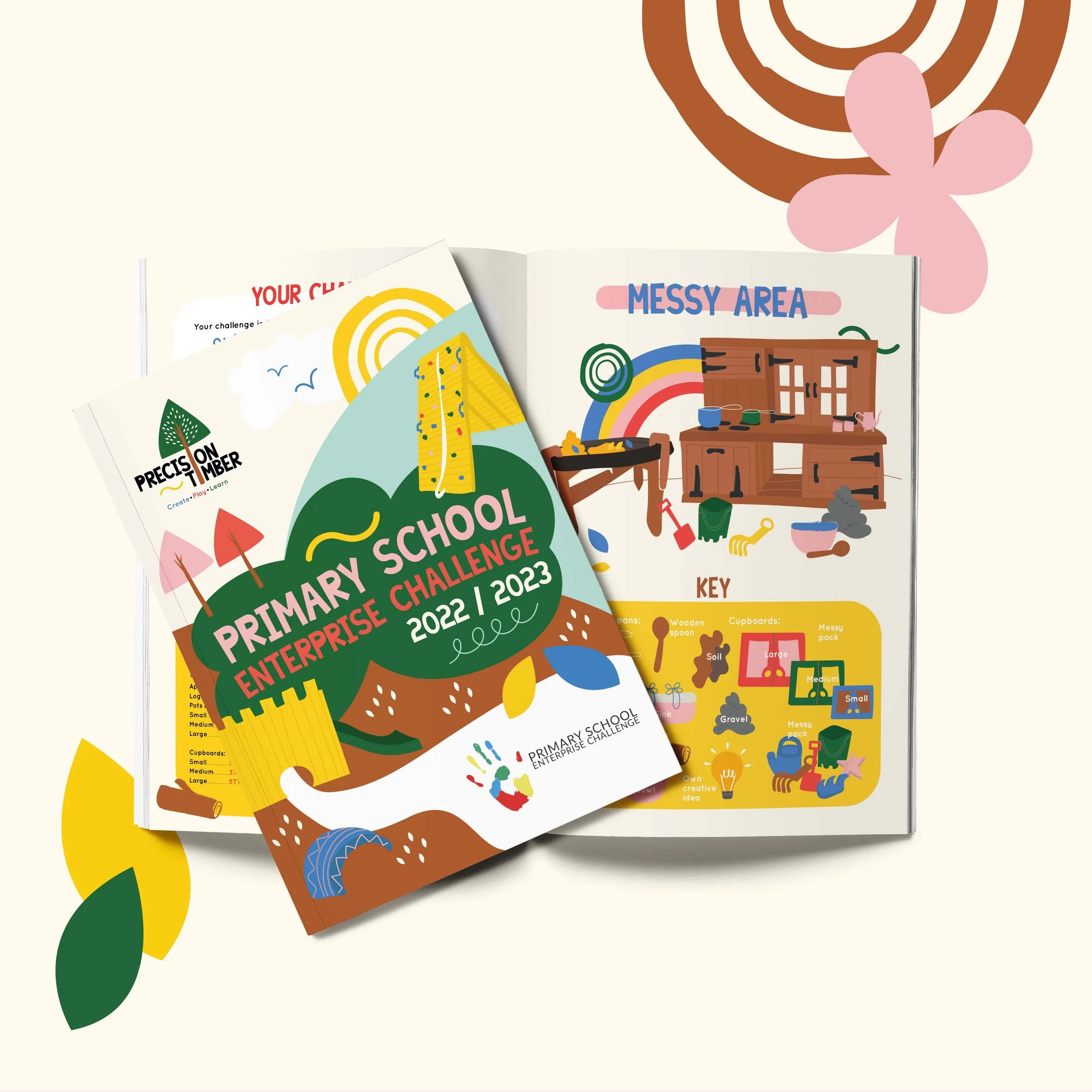
Rebranding project for Precision Timber along with an activity book design collaborating with Primary School Enterprise Challenge.
Our rebranding for Precision Timber delivers a fresh, modern identity that reflects the company’s craftsmanship, quality, and expertise in the timber industry.
Amy Blackwell - Founder
“Amazing Charlie, I absolutely love it!!”
Create
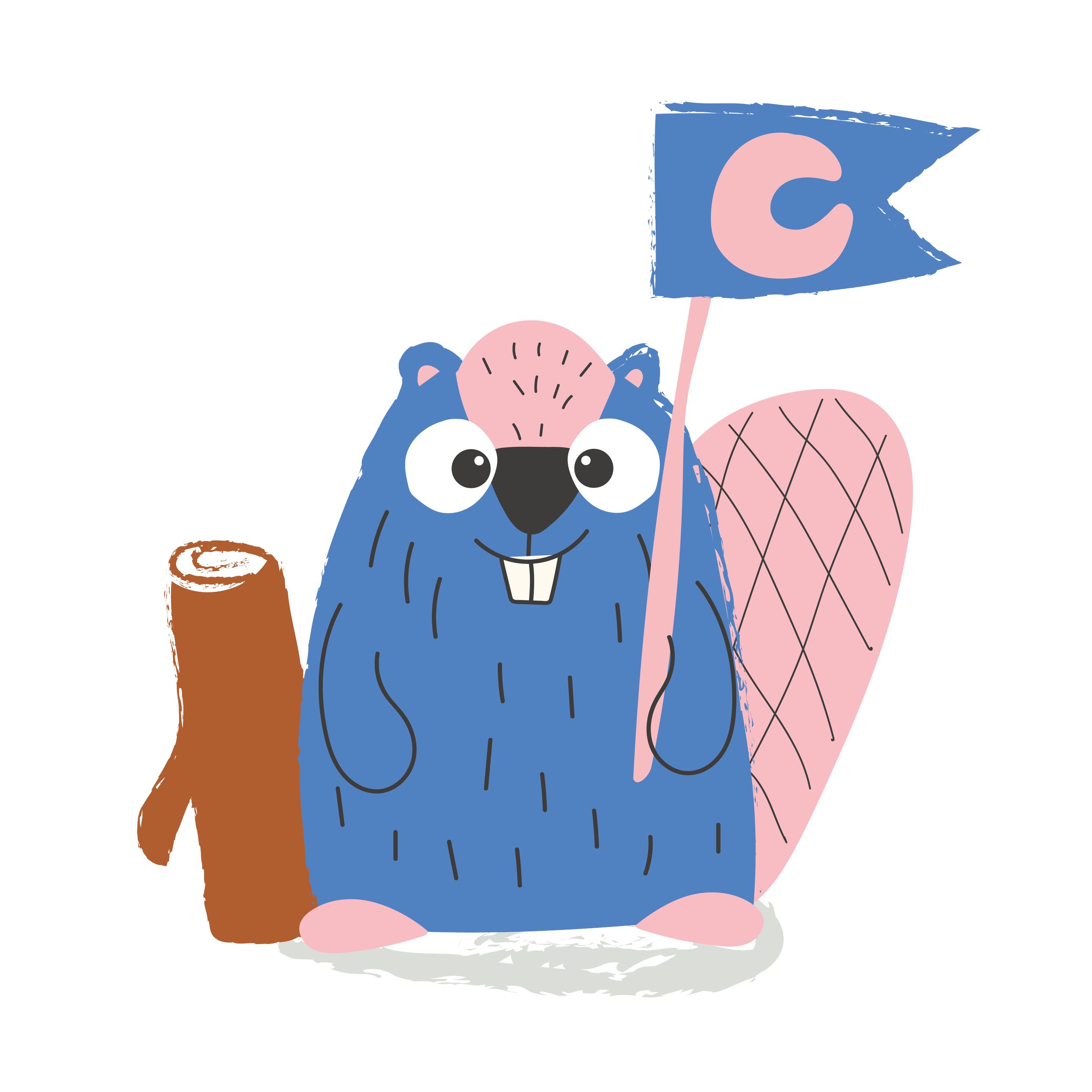
Kit enjoys burrowing in the banks of his local river, felling and gnawing trees with his strong teeth, creating massive log, branch, and mud structures to block streams and turn fields and forests into the large ponds.
He is a busy bee creating all day long!
Earthy greens, warm wood tones, and playful pops of colour create a balance between professionalism and fun, appealing to both children and parents.
Together, the colours and typography establish a cohesive, engaging, and trustworthy identity that truly represents Precision Timber’s expertise in creating high-quality, sustainable play spaces.
CHIP
Play
Chip loves all things play! She loves to run, climb, jump, twist, & tumble across the woodland.
She swooshes her ‘P’ shaped tail everywhere she goes and bounces around with lots of energy!
The typography combines a bold, approachable typeface with soft, rounded edges, reinforcing the brand’s friendly and inviting personality while ensuring clarity and readability across all materials.
HOOT
Learn
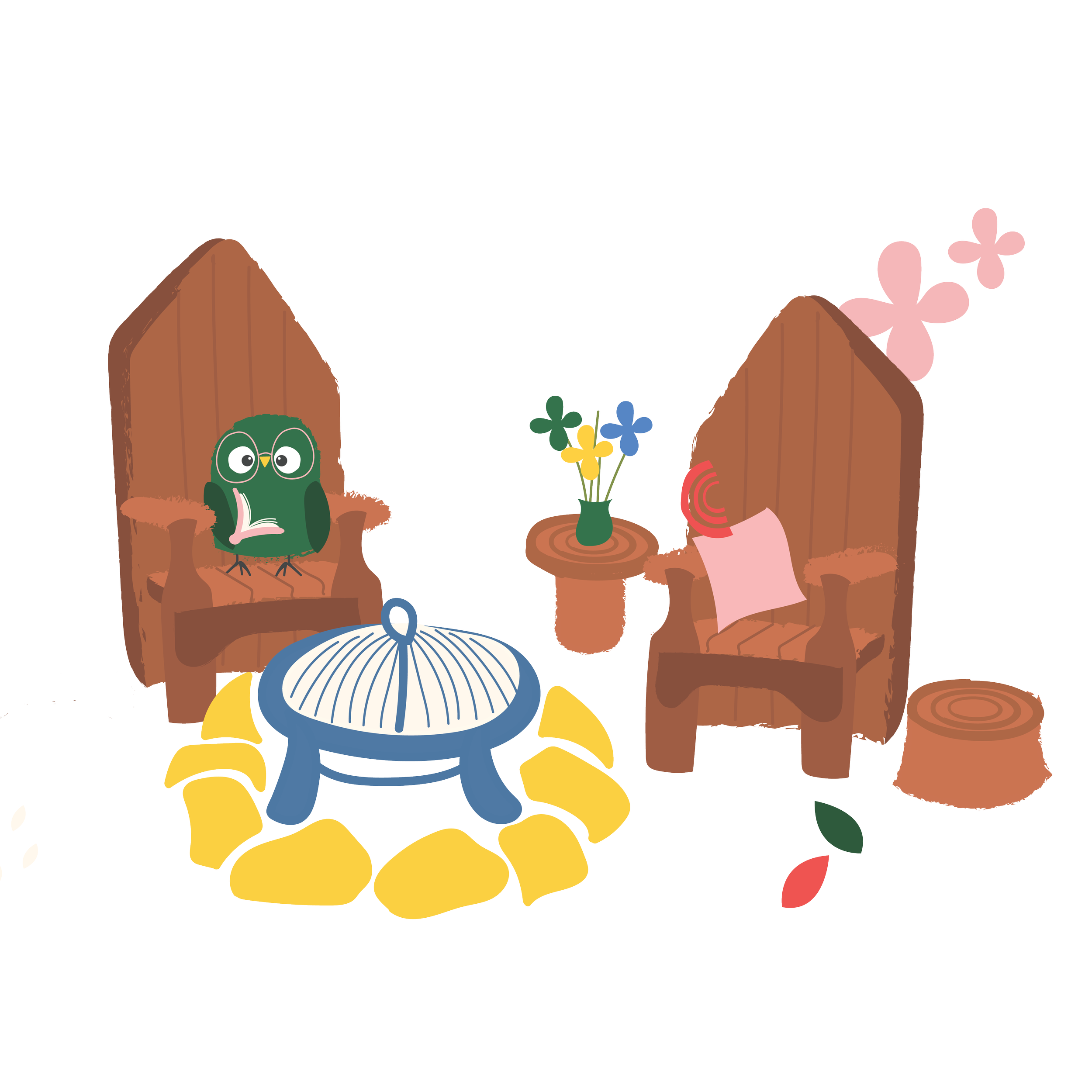
Hoot enjoys play and creating and learning new things.
He is very wise and a very good listener and loves to play with his friends!
The rebranding for Precision Timber features a vibrant yet natural color palette, carefully chosen to reflect the company’s connection to nature and commitment to sustainability.
KIT
Paul Robson - Primary School Enterprise Challenge

